Making work visible with GitHub Projects and Grafana
In the book Making work visible, Dominica DeGrandis exposes time-wasting activities at work and demonstrates how you can achieve flow efficiency by making work visible. Optimizing workstream management for effectiveness and efficiency is always something I think about. I’ve used many tools in the past to plan and track workstreams, and recently had a happy realization that GitHub Projects developed enough to call my number one and only tool for making work visible. I thought to apply some of the learnings from the aforementioned book and leverage GitHub Projects to make work visible. For the sake of measuring and improving, I’ve used Grafana to visualize few aggregates from the GitHub Project by using Grafana GitHub datasource.
Prerequisite
- This post assumes basic familiarity with GitHub Projects, so in case you are unfamiliar with the product, I’d highly encourage to Learn about Projects first.
- In a similiar way, the post assumes basic familiarity with Grafana. If you are new to Grafana and want to try it out first, you can either use the Free forever hosted plan or Install it on your own machine.
Making work visible with GitHub Project
This post assumes basic familiarity with GitHub Projects, so in case you are unfamiliar with the product, I’d highly encourage to Learn about Projects first.
To set up an example project, I’ve created an example repository with random issues. Here are some of the goals I had in mind when building the project:
- The project should be a central and the only place for multiple teams to manage their stream of work and provide visibility to stakeholders.
- The project should support some basic workflow of development, where the incoming requests are created as issues, triaged, worked on and completed accordingly.
- It should be possible to monitor and measure for improving workflows, as well as for cultivating culture of making work visible.
Custom fields
Determining what fields are needed for optimal tracking and workflows is not an easy task. Typically it requires multiple iterations until you find a right set of fields to have. One thing to be aware about is that the more required fields you have, the more would be the cost of keeping things up to date. The optimal number of fields I’d recommend is something in between 5 and 10. Less than 5 could be an indicator that important information is missing, more than 10 is an indicator that workflow needs to be simplified.
For all custom fields I’ve added descriptions which are also visible in the project itself. This is a nice and easy way for the readers to understand the meaning of the field, as well as it leads to improved usability of the projects.
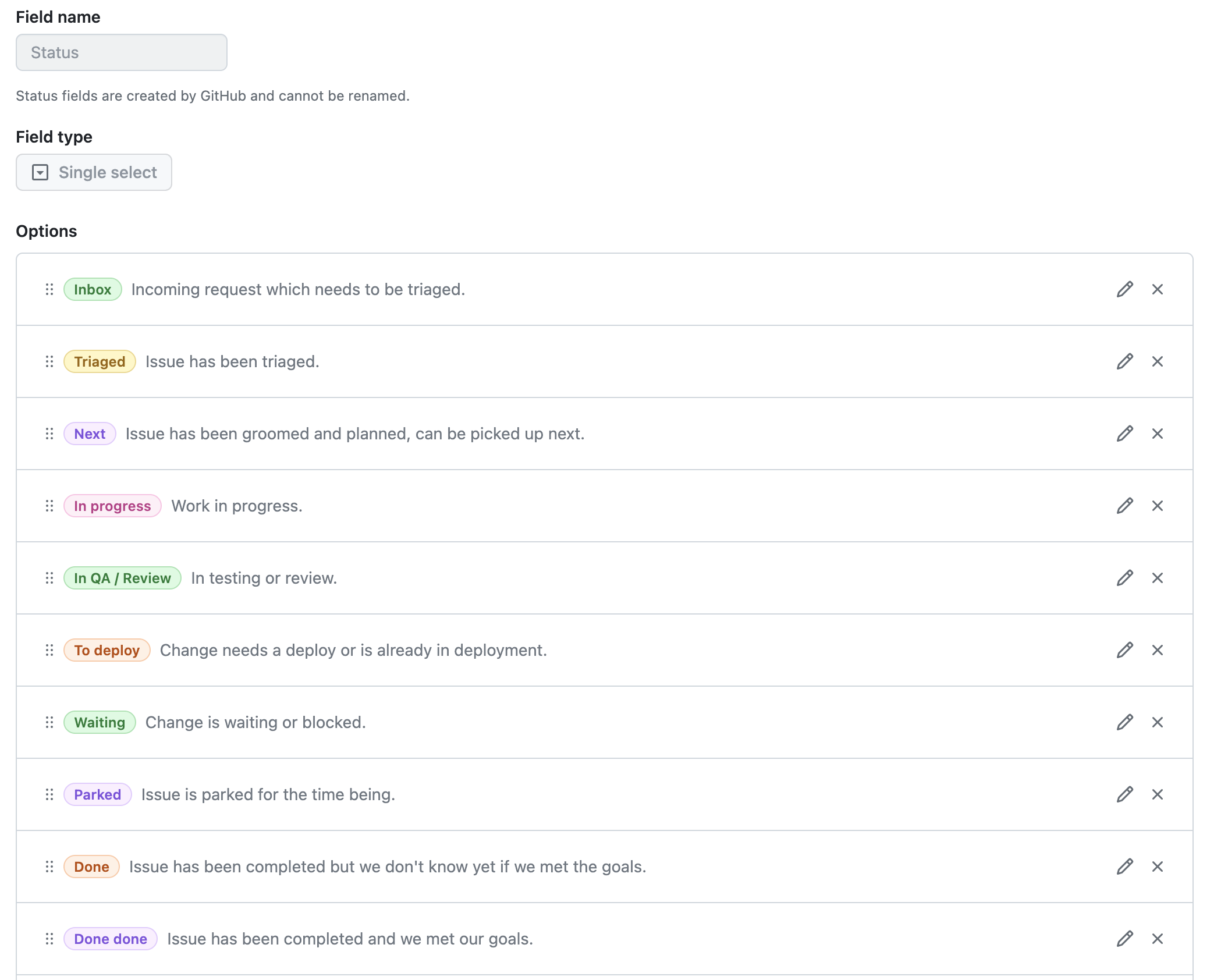
Status
Type: Single select Options: Inbox, Triaged, Next, In progress, In QA/Review, To deploy, Waiting, Parked, Done, Done done Intent: Capture the current state of an issue.
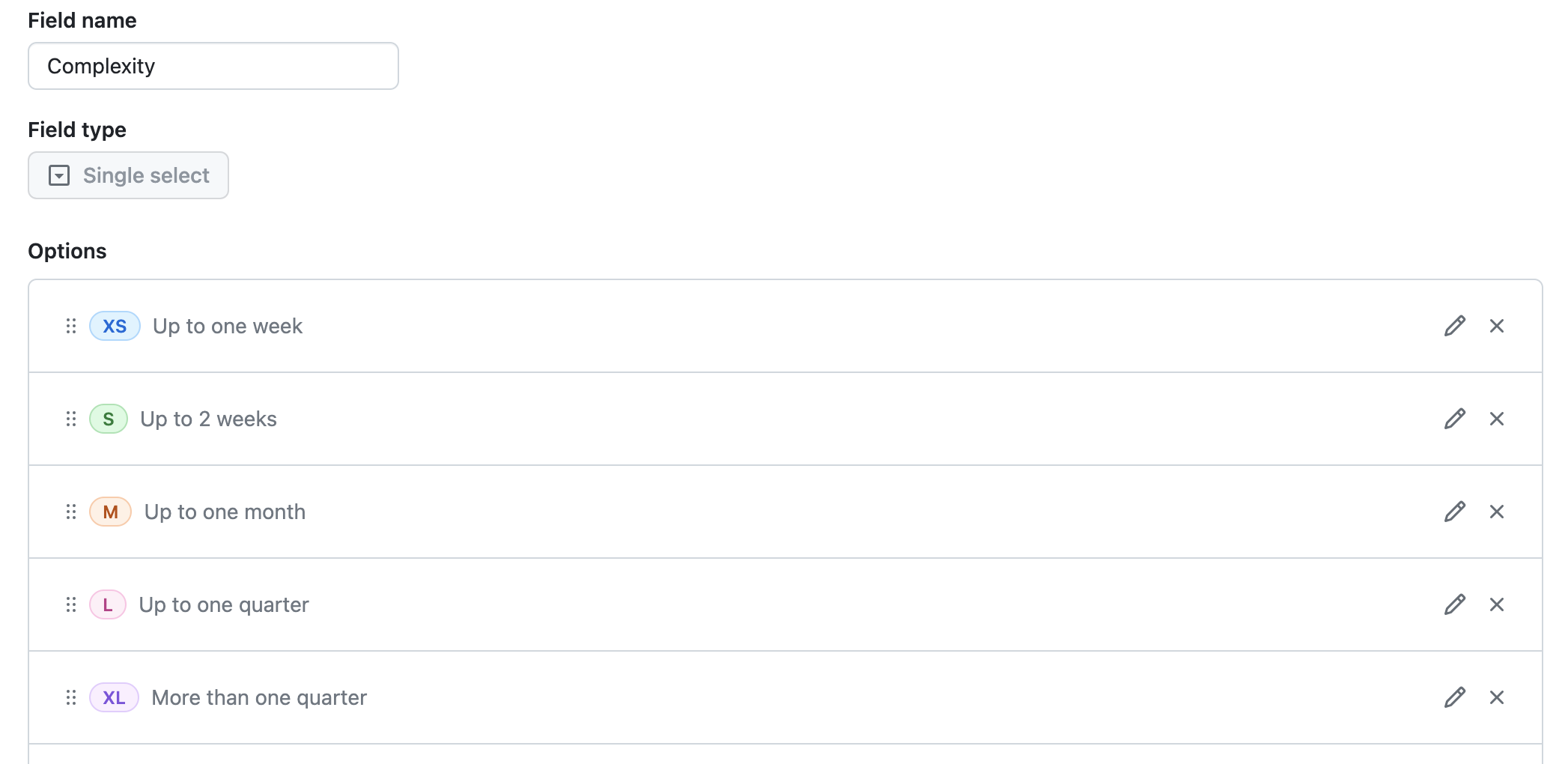
Complexity:
- Type: Single select
- Options: XS, S, M, L, XL
- Intent: Capture rough complexity of an issue. Each option maps to a rough time window which can be used as a guide for understanding how long a certain issue might take.
Start and end
- Type: Date
- Options: Calendar date
- Intent: Capture start and end date to have a roadmap view. Helps to create predictability.
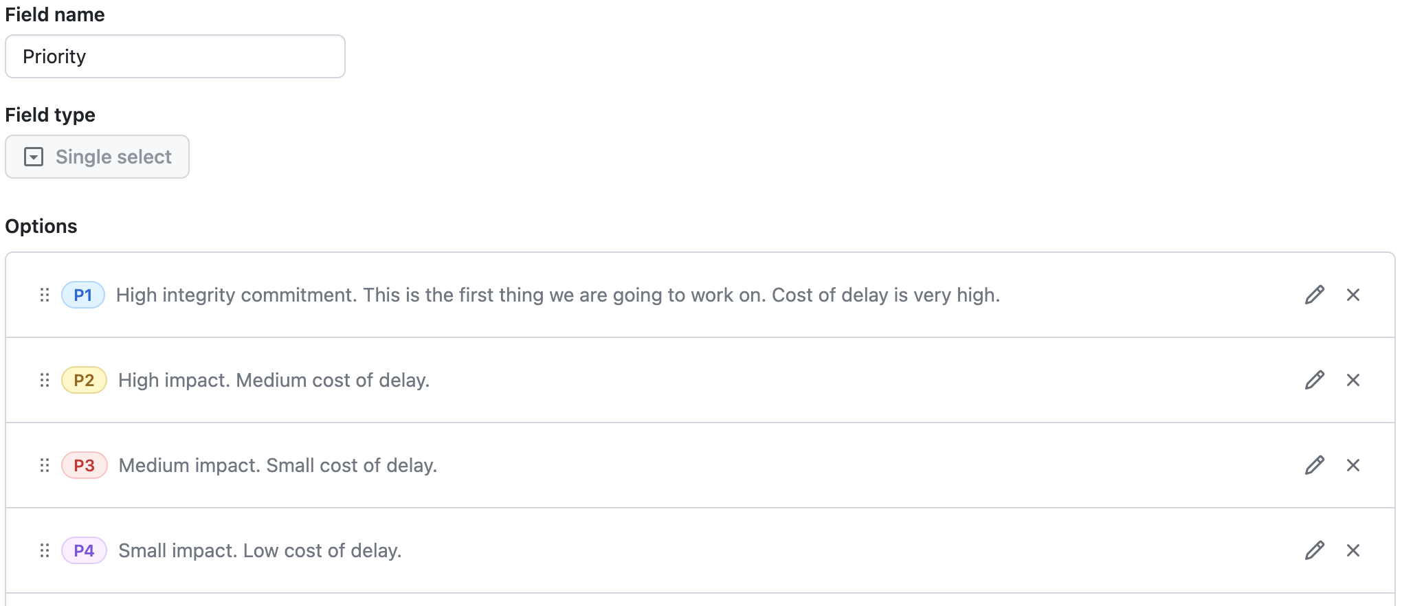
Priority
- Type: Single select
- Options: P1, P2, P3, P4
- Intent: Capture relative priority.
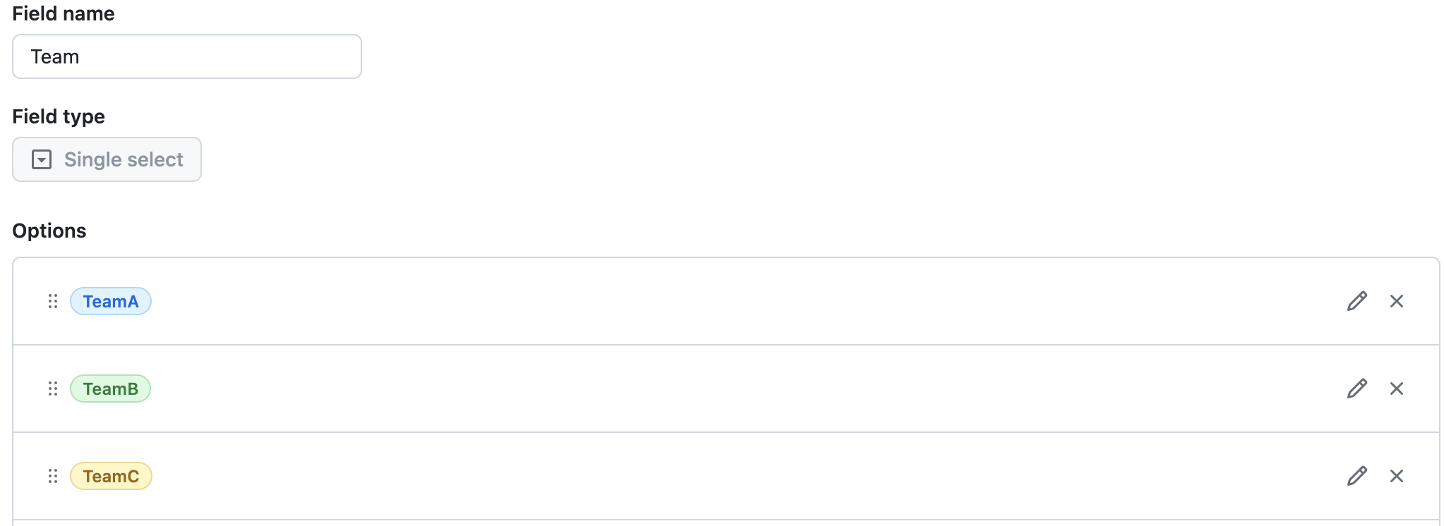
Team
- Type: Single select
- Options: TeamA, TeamB, TeamC
- Intent: Provide visibility about the team accountable for the issue.
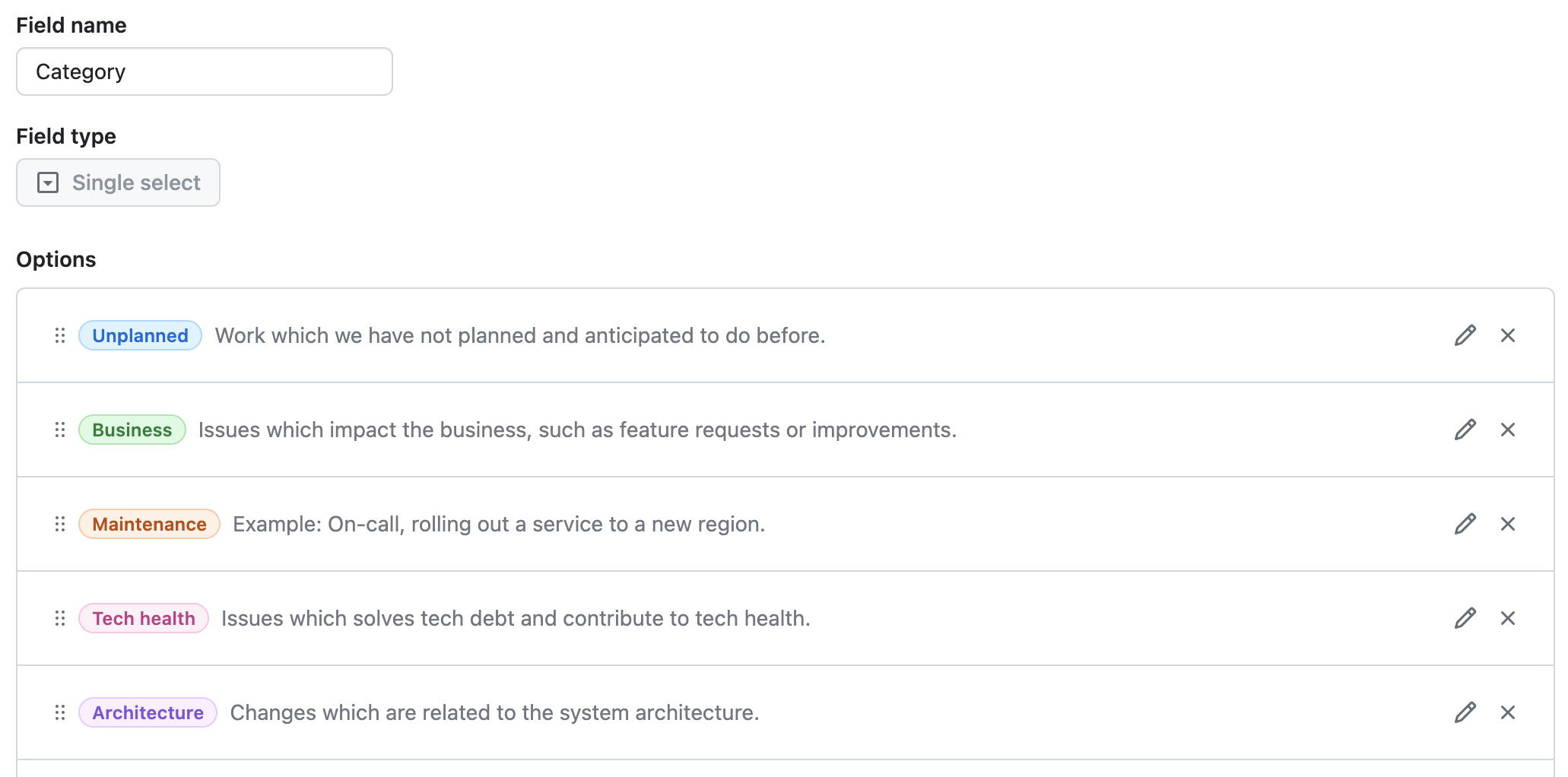
Category
- Type: Single select
- Options: Unplanned, Business, Maintenance, Tech Health, Architecture
- Intent: Understand different streams of work that the team is working on.
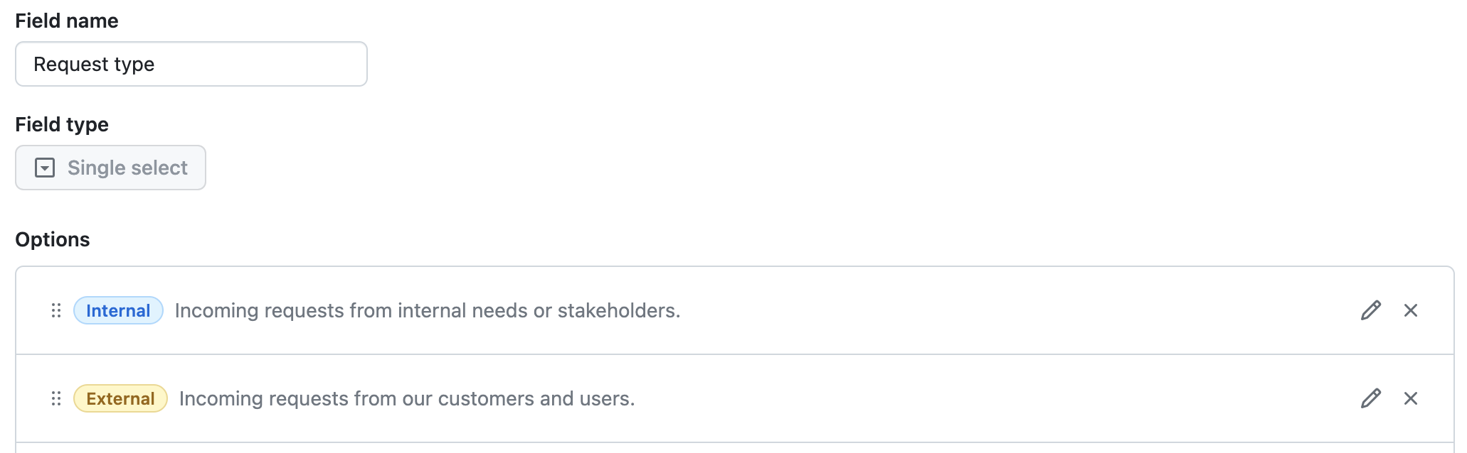
Request type
- Type: Single select
- Options: Internal, External
- Intent: Understand where the request/issue is coming from.
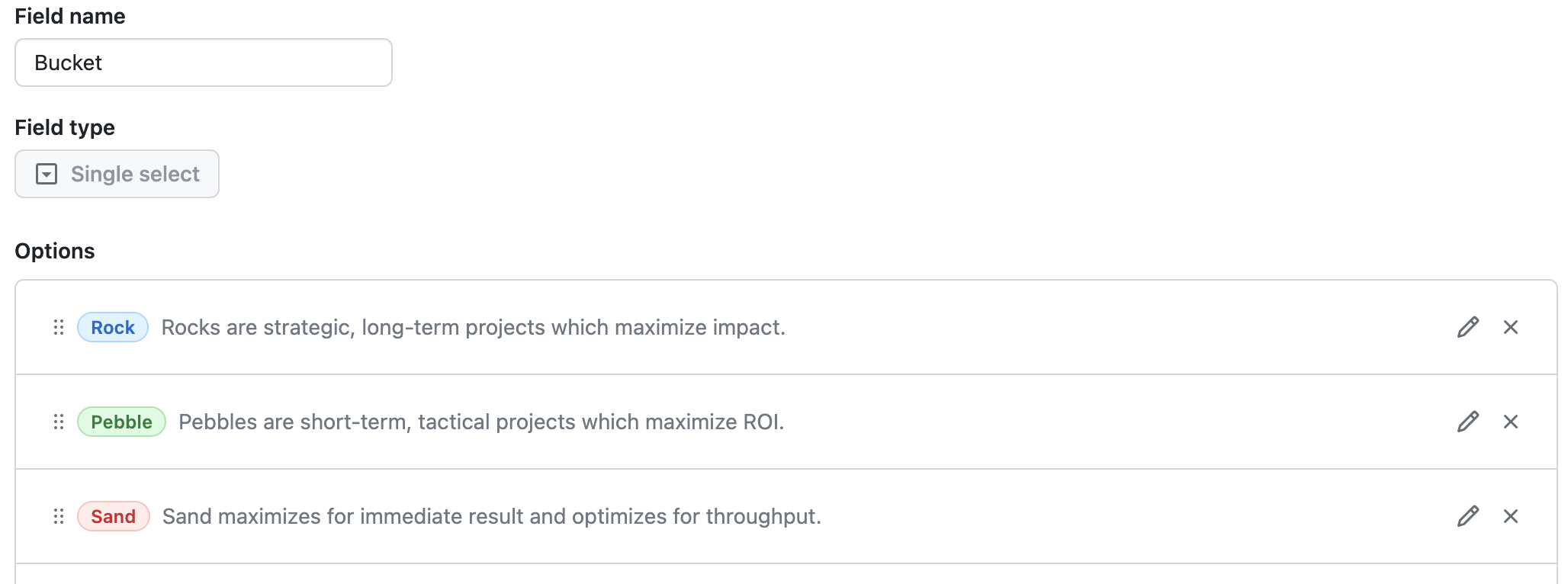
Bucket
- Type: Single select
- Options: Rock, Pebble, Sand
- Intent: Understand relative impact and scope of the issue.
Views
Project views are the superpower of GitHub projects. They allow you to zoom in to the specific aspects of the project and organize issues in a way which can serve different audiences. I’ve created 6 different views on the project.
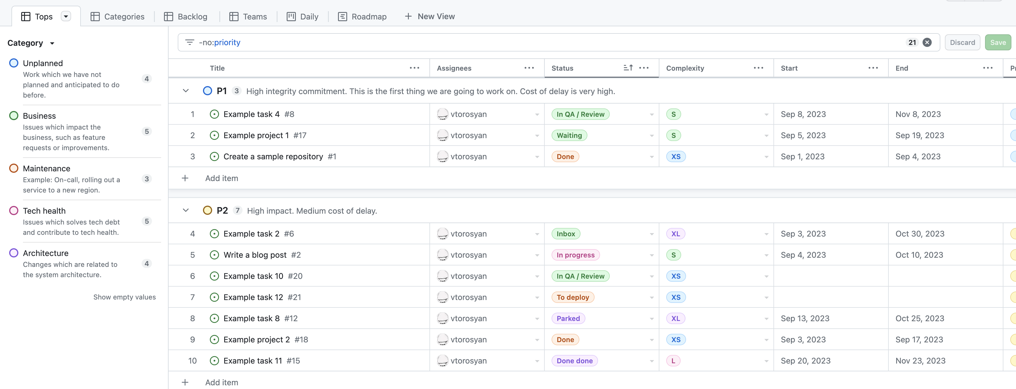
Tops
Tops is grouping issues based on their priority. Additionally, this view is sliced by category, which allows you to easily filter issues based on a given category.
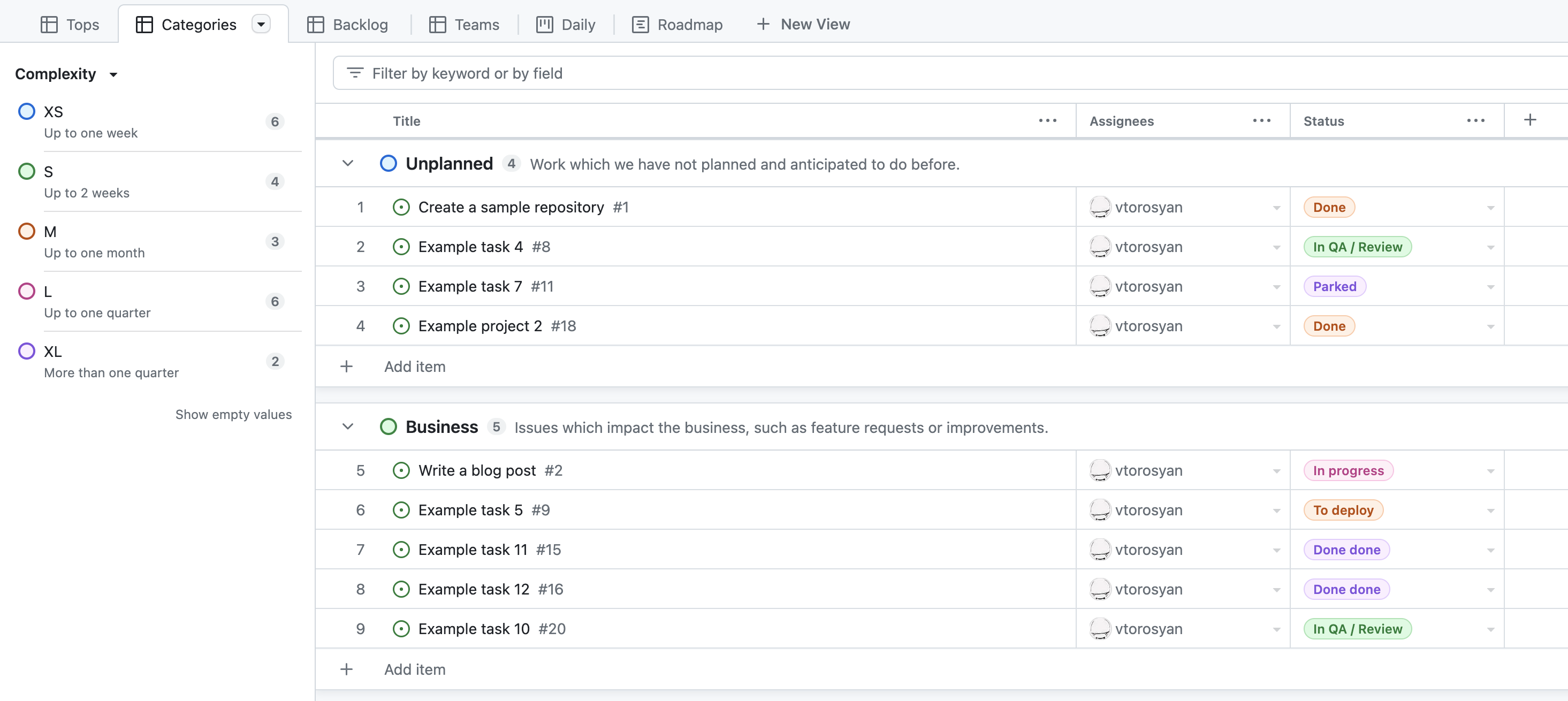
Categories
In Categories view issues are grouped by the Category and sliced by Complexity, which gives you a chance to easily understand the weight of each issue in a given category.
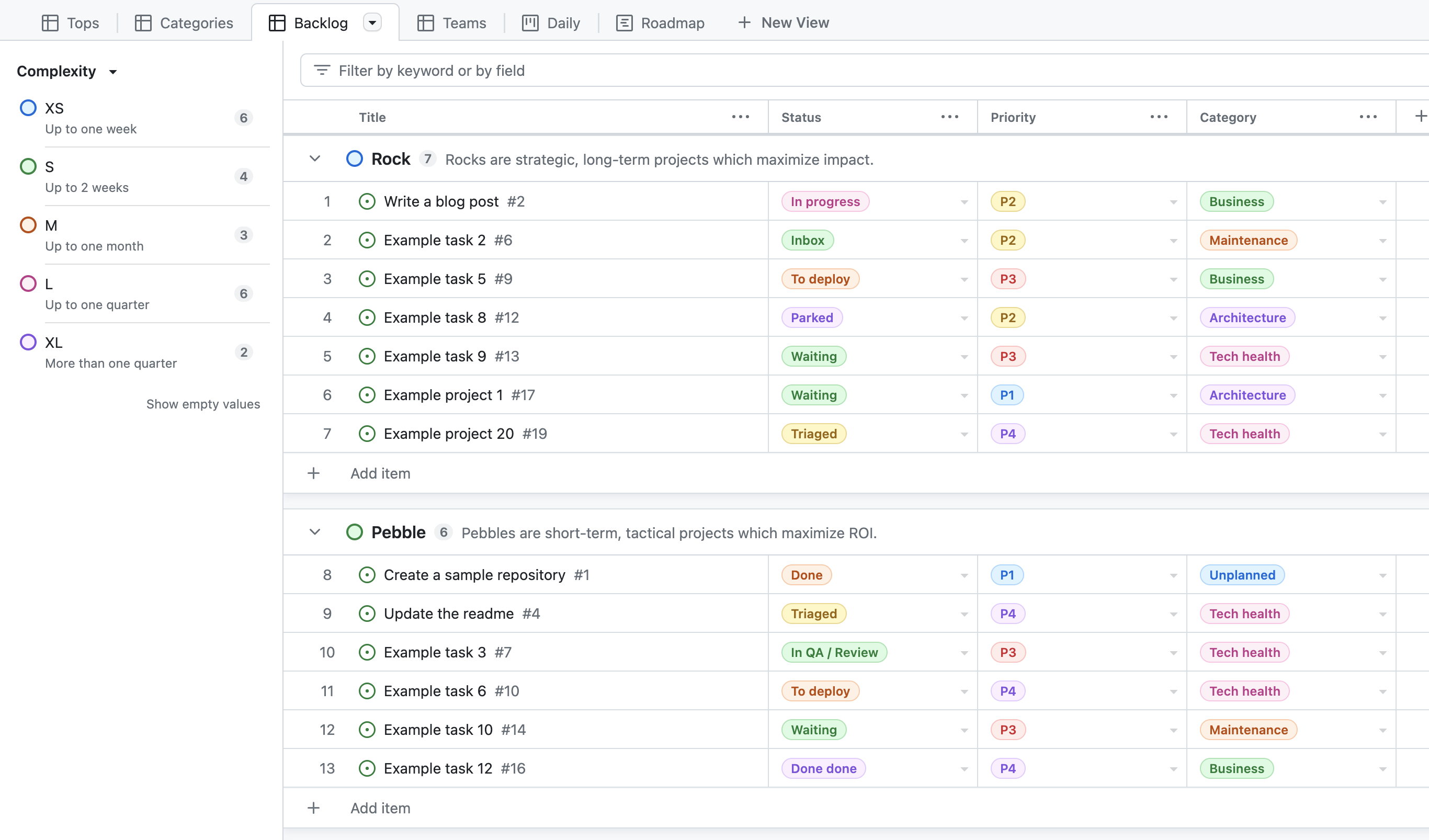
Backlog
The Backlog view gives you a high level overview of the impact of the issues.
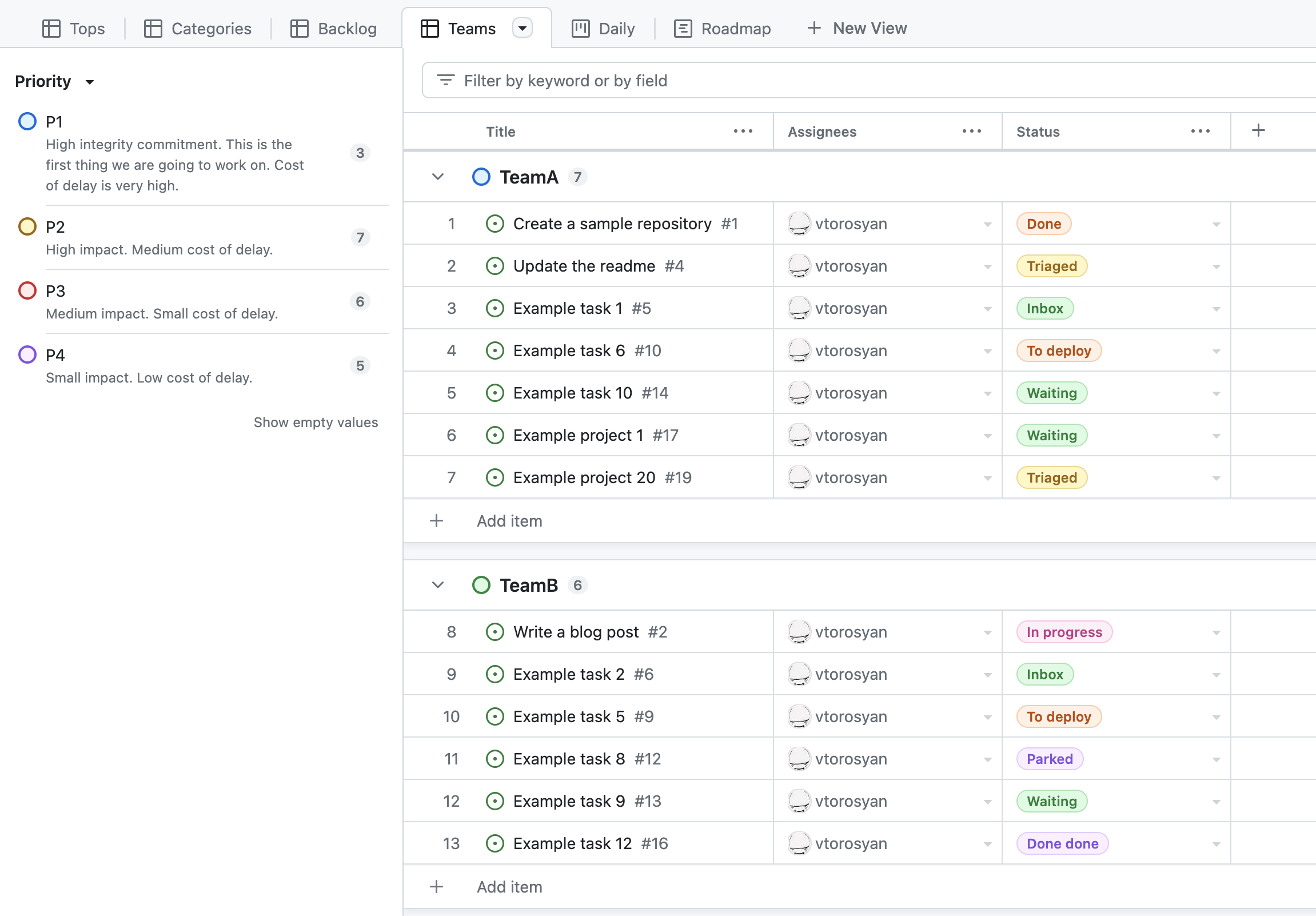
Teams
In Teams you can understand issue distribution among the teams from a very first glance.
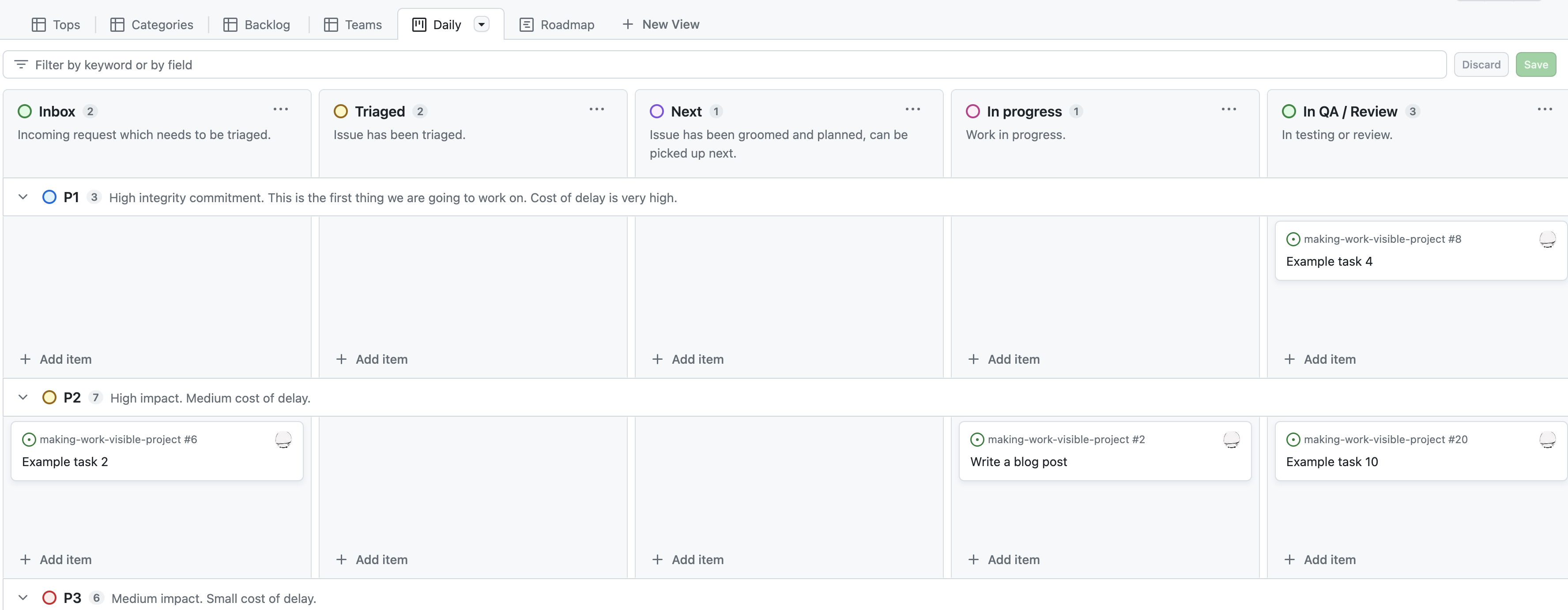
Daily
Daily view is a board which teams can use on a day-to-day basis to talk about the progress they are making. Swimlanes are very helpful in grouping issues based on the priority and ensure that teams would focus on the most important issues first.
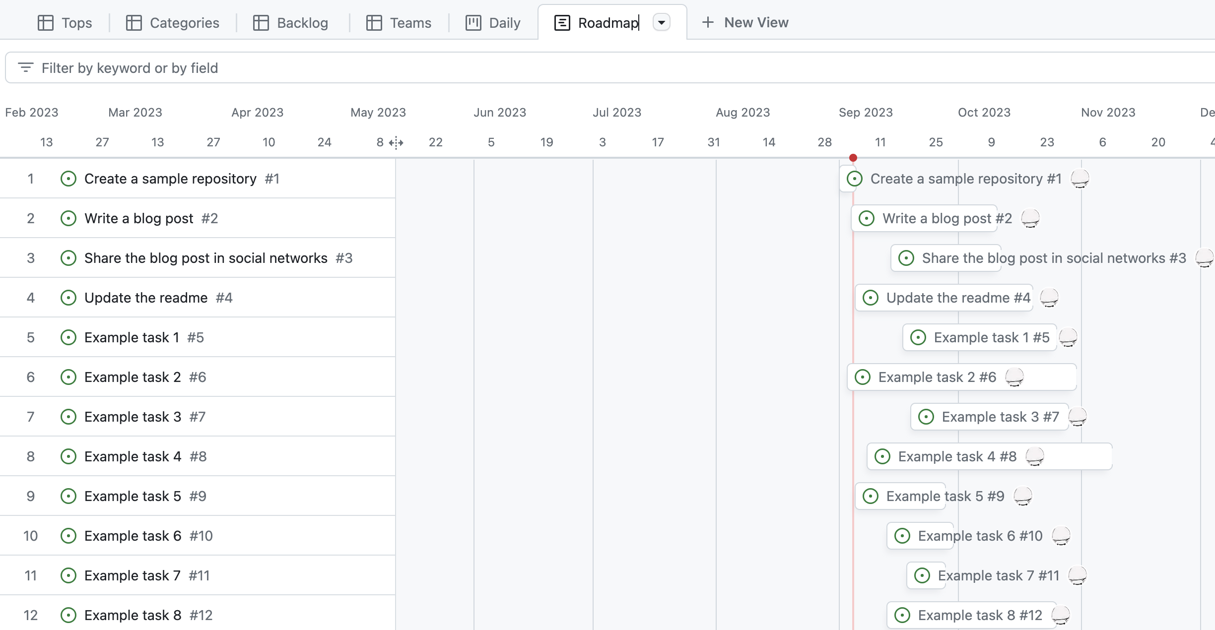
Roadmap
Last but not least, Roadmap surfaces issues with timelines.
Tips
There is so much more you can do with the projects. Here are couple of extra ideas:
- Automate projects with workflows
- Export project data to TSV for analysis and importing to other tools.
- Automatically add issues to the project from different repositories.
Make work visible with Grafana
Grafana allows you to dashboard almost anything. I’ve installed Grafana GitHub datasource on my free cloud instance. The datasource allows you to query Projects directly (and much more), all you need is a Personal Access Token in GitHub with the right permissions.
My goal with a Grafana dashboard is:
- Surface work in progress to engage safety valves when needed (i.e. to limit WIP when needed).
- Visualize distribution of different categories and priorities between teams to ensure fair distribution and workload.
- Visualize complexity distribution to know what to commit to and not.
- Understand the distribution of rock, pebble and sand in the backlog to ensure that there is good balance between strategic and tactical work.
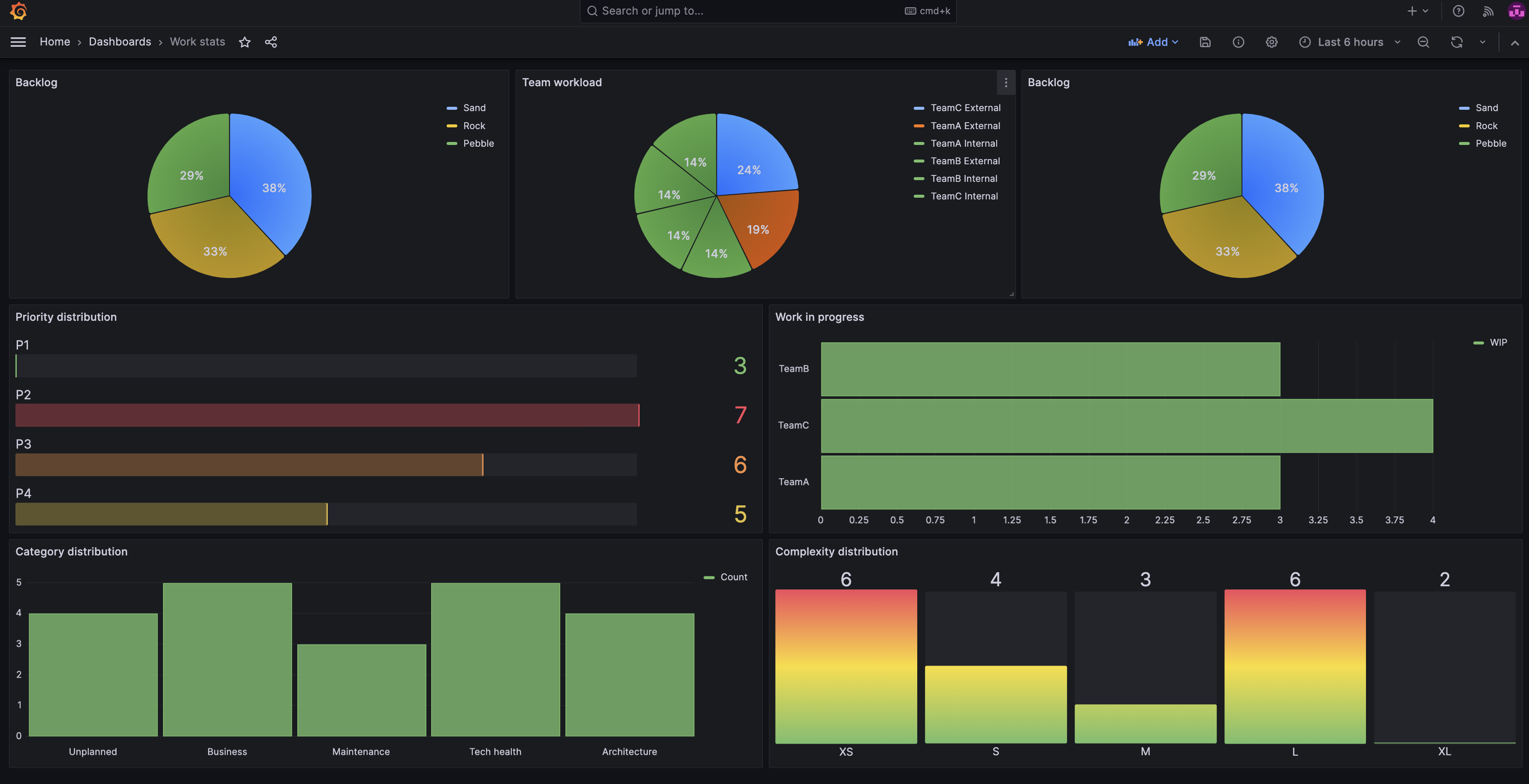
I’ve leveraged Grafana Transformations to transform the data from GitHub to a format which I can visualize with Grafana panels.
Tips
- Use Grafana Alerting to warn/alert when certain limits are hit, for example work-in-progress limit.
- Use GitHub Datasource to measure cycle time and other flow metrics (and watch the work, not the people).
References
- GitHub project available in public to view and play with.
- GitHub repository with example issues.